Living room paint colors that make a space feel bigger aren’t just about aesthetics; they’re about manipulating perception. The right colors can dramatically alter how large a room feels, playing with light reflection and creating illusions of spaciousness. This guide explores the psychology of color and offers practical tips for choosing the perfect palette to transform your living room from cramped to comfortable.
We’ll delve into light and bright palettes, strategic color blocking techniques, the subtle impact of patterns and textures, and the crucial role of furniture placement and decor. Through illustrative examples and expert advice, you’ll learn how to maximize your living room’s potential, regardless of its actual size. Get ready to unlock the secrets to a visually expansive and inviting living space.
The Illusion of Space
Color plays a surprisingly significant role in how large or small a room feels. Light, airy colors tend to make spaces appear more expansive, while darker shades can create a cozier, but smaller, atmosphere. This isn’t just a matter of personal preference; it’s a result of how our eyes and brains process visual information.The psychology behind this phenomenon is rooted in how we perceive light and depth.
Brighter colors reflect more light, creating a sense of openness and airiness. This increased light reflection tricks the eye into perceiving more space than is physically present. Conversely, darker colors absorb more light, making the room feel enclosed and smaller. This effect is further amplified by the way our brains interpret shadows and contrast; darker areas recede visually, while lighter areas seem to advance, impacting our overall perception of the room’s dimensions.
Light Reflection and Spaciousness
Light reflection is crucial in creating the illusion of a larger space. Imagine a small room painted a deep navy blue. The dark color absorbs much of the available light, resulting in a dimly lit, seemingly smaller room. Now, picture the same room painted a soft, pale gray. The light gray reflects light more effectively, brightening the room and making it feel significantly more open and spacious.
This is because the increased light bounces off the walls, creating a sense of depth and expanding the perceived boundaries of the room. The difference isn’t just subtle; it’s a demonstrably noticeable shift in the overall feeling of the space. Consider the difference between a sunlit white room and a dimly lit brown one – the former feels significantly larger.
The higher the light reflectance value (LRV) of the paint color, the more light it reflects and the bigger the room will appear.
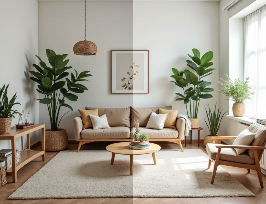
Light and Bright Color Palettes
Choosing the right paint color can dramatically impact the feel of a small living room. Light and bright palettes are particularly effective at creating an illusion of spaciousness, allowing natural light to bounce around and making the room feel less cramped. The key is to select shades that are both cheerful and visually expansive.Light and airy colors create a sense of openness and airiness, which is crucial in smaller spaces.
They reflect more light than darker shades, making the room feel brighter and larger than it actually is. This effect is amplified by the careful selection of undertones and the strategic use of color in different areas of the room.
Examples of Light and Airy Paint Colors
Selecting the right paint color for your living room can significantly impact the overall feel of the space. The following table provides examples of light and airy paint colors suitable for small living rooms, along with their hex codes, descriptions, and best use cases.
Light and airy living room paint colors, like soft blues or greys, are great for making a small space feel larger. This principle of maximizing space applies to other rooms too; for example, consider a tall bathroom vanity cabinet for maximizing storage space to cleverly use vertical space. Just like the right paint color can visually expand your living room, smart storage solutions can create the illusion of more space in any room.
| Color Name | Hex Code | Description | Best Use Case |
|---|---|---|---|
| Swiss Coffee | #F6F1E9 | Warm, creamy off-white with subtle beige undertones. | Creates a cozy and inviting atmosphere while maintaining brightness. Ideal for rooms with limited natural light. |
| Cloud Nine | #E6E6FA | Light lavender with a soft, airy feel. | Adds a touch of serenity and elegance without feeling overwhelming. Suits rooms with both natural and artificial lighting. |
| Sea Salt | #B2BEB5 | Subtle, cool-toned grey-green with a calming effect. | Creates a tranquil and refreshing atmosphere. Best suited for rooms with ample natural light. |
| Pale Oak | #F2E8CF | Light beige with warm, honey-like undertones. | Provides a sense of warmth and comfort. Suitable for rooms facing south or west, receiving plenty of sunlight. |
The Effect of White and Off-White Shades on Amplifying Natural Light
White and off-white paint colors are exceptionally effective at maximizing natural light in a small living room. Their high light reflectance value (LRV) means they bounce light around the room, creating a brighter, more open feel. Off-whites, with their subtle undertones of cream, beige, or grey, offer a warmer alternative to stark white while still maintaining excellent light reflectivity.
This effect is especially noticeable in rooms with limited natural light sources, such as north-facing rooms or those with small windows. The increased brightness can visually expand the space, making it feel more airy and spacious.
Cool-Toned Pastels versus Warm-Toned Pastels
Cool-toned pastels, such as light blues, greens, and lavenders, create a calming and serene atmosphere. They evoke feelings of tranquility and spaciousness, often associated with open skies and natural landscapes. These colors work particularly well in rooms with abundant natural light, enhancing the sense of airiness. Conversely, warm-toned pastels, including peach, cream, and beige, offer a cozy and inviting ambiance.
Light and airy living room paint colors, like soft blues or greys, can really open up a small space. If you’re documenting your home renovation, including the paint job, you might find Kinemaster Pro Mod apk helpful for editing your videos. After all, showcasing your beautifully painted, spacious-feeling living room deserves top-notch editing! Consider these lighter shades to maximize the impact of your hard work.
They create a feeling of warmth and comfort, making the space feel welcoming and intimate. While they might not amplify light as dramatically as cool tones, they still contribute to a bright and airy feel, particularly in rooms with less natural light. The choice between cool and warm pastels depends on the desired mood and the amount of natural light available in the living room.
Strategic Use of Color Blocking
Color blocking is a powerful tool for manipulating the perceived size and flow of a room. By strategically using contrasting colors, we can draw the eye, create focal points, and ultimately make a small living room feel more expansive. It’s about more than just slapping a bold color on a wall; it’s about understanding how color interacts with light and space.Color blocking offers a dynamic alternative to all-over paint schemes, allowing for personality and visual interest while still contributing to the illusion of spaciousness.
The key lies in careful planning and a good understanding of color theory.
Accent Wall Enhancement
Imagine a small living room with limited natural light. The walls are currently painted a pale, almost washed-out beige, making the room feel somewhat drab and closed-in. To counteract this, we introduce a single accent wall painted a vibrant, yet not overwhelming, teal. This teal wall, positioned opposite the main window, becomes a focal point. The light reflects off the teal, creating a sense of depth and brightness.
The lighter beige on the remaining walls prevents the teal from feeling too dominant, maintaining a sense of spaciousness while adding a striking visual element. The contrast between the cool teal and the warm beige also adds visual interest and prevents the room from feeling monotonous.
Strategic Use of Darker Colors, Living room paint colors that make a space feel bigger
Darker colors can be surprisingly effective in a small living room, provided they’re used strategically. For example, consider a living room with a recessed area, perhaps a small alcove designed for seating or a built-in shelving unit. Painting this alcove a deep, saturated navy blue creates a sense of intimacy and drama without overwhelming the space. The darker color subtly recesses the alcove, making the rest of the room appear larger by contrast.
The key is to keep the surrounding walls light and airy to balance the dark accent. This technique creates a sense of visual interest and depth without sacrificing the overall feeling of spaciousness. A similar effect could be achieved using a dark charcoal grey or even a deep burgundy, depending on the desired aesthetic.
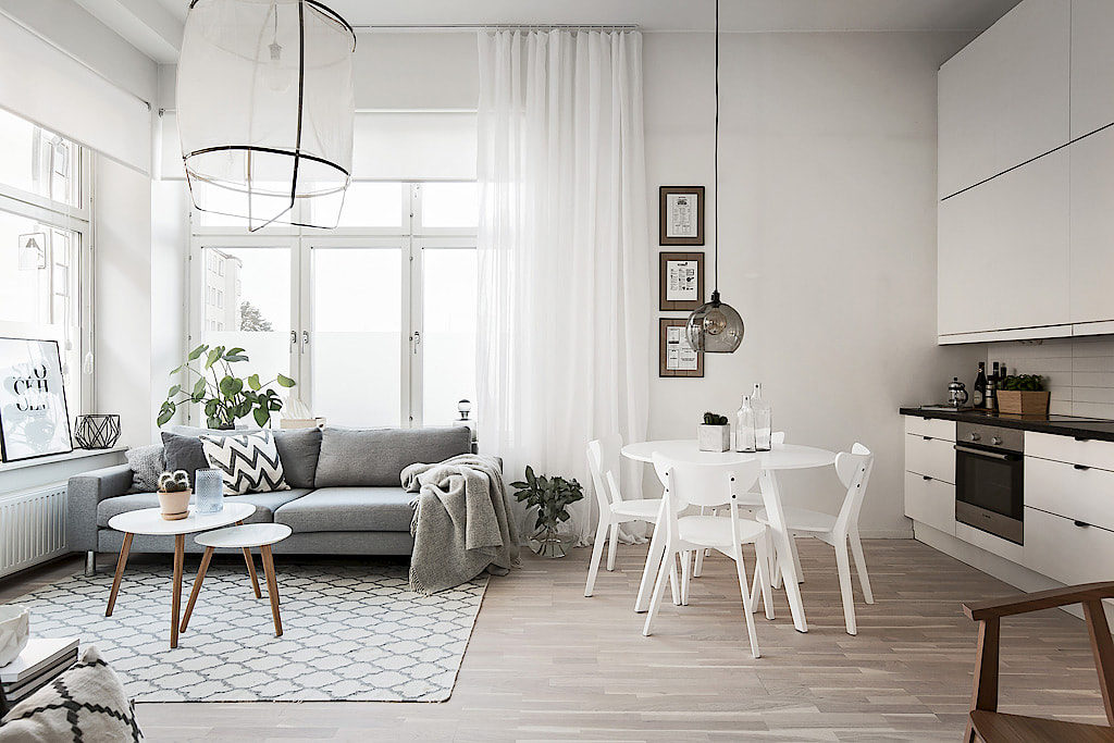
Living Room Layout with Color Blocking
Consider a living room with a seating area, a fireplace, and a small dining nook. The walls are painted a soft, creamy white. The seating area is defined by a wall painted a warm, sunny yellow, drawing the eye and creating a welcoming focal point. The fireplace wall is painted a neutral, sophisticated grey, complementing the yellow and providing a calming backdrop.
The dining nook, often overlooked in smaller spaces, is highlighted with a refreshing, pale mint green. This subtle color blocking defines each area, creating visual separation and preventing the room from feeling cluttered, even though it’s multifunctional. The overall effect is one of spaciousness and visual harmony, with each zone distinctly defined yet seamlessly integrated into the whole.
Incorporating Patterns and Textures
Source: houseandhome.ie
Adding patterns and textures is a subtle yet powerful way to enhance the feeling of spaciousness in a living room. The right choices can create visual depth and interest without overwhelming the room, making it feel larger and more inviting. Careful consideration of scale and placement is key to achieving this effect.The impact of patterns on the perception of space is significant.
Small-scale patterns, for instance, can make a room feel larger because they don’t dominate the eye. Larger, bolder patterns, on the other hand, can visually shrink a room. The key is to use patterns strategically, focusing on subtlety to maintain a sense of openness.
Light and airy living room paint colors, like soft blues or greys, are fantastic for making a small space feel larger. Thinking about maximizing space in your home? Check out this guide for finding the best bathroom vanity cabinet for small bathrooms under $500 to optimize your bathroom’s storage. Returning to the living room, remember that the right paint color can dramatically impact the perceived size, so choose wisely!
Subtle Patterns and Their Impact on Space
Subtle patterns create a sense of visual interest without overwhelming a room, contributing to a feeling of spaciousness. The use of delicate patterns helps to avoid the visual “clutter” that can make a space feel cramped. Here are some examples:
- A faint, barely-there stripe on the walls can add visual interest without being overpowering. Imagine a very light grey stripe on a white wall; the subtle contrast adds dimension without closing in the space.
- Small-scale floral patterns on curtains or upholstery can bring life to the room without making it feel busy. Think delicate botanical prints in muted tones, rather than large, bold blooms.
- A textured wallpaper with a very subtle pattern, such as a lightly embossed damask, can add visual interest and depth without feeling heavy or overwhelming. The texture plays a bigger role than the pattern itself in this case.
Utilizing Texture for Visual Interest
Texture adds another layer of visual richness to a room, creating depth and interest. However, it’s crucial to select textures carefully to avoid making the room feel smaller. Overly heavy or bulky textures can have the opposite effect, so choosing the right texture is key.
Using natural materials like linen or cotton for curtains and upholstery creates a sense of lightness and airiness. These materials have a subtle texture that adds visual interest without feeling heavy.
Incorporating woven textures, such as a jute rug or a textured throw blanket, adds visual interest and warmth without overwhelming the space. The open weave of these materials allows light to filter through, preventing a feeling of being closed in.
Avoid using heavy, plush fabrics excessively. While they might feel luxurious, they can visually weigh down a room, especially if used in abundance. A single plush element, such as a velvet cushion, can be used as an accent, but too much can be overwhelming.
Textures that Complement Light and Airy Paint Colors
Light and airy paint colors benefit from textures that enhance their airy feel without competing with them. These textures often have a natural or organic feel.
- Linen: A classic choice for curtains, upholstery, or even wall coverings, linen’s subtle texture adds a touch of elegance and warmth.
- Cotton: Soft and breathable, cotton is a versatile option for bedding, curtains, and throws. Its texture is understated yet adds visual appeal.
- Jute: This natural fiber creates a rustic and textured feel, perfect for rugs or baskets. Its open weave allows light to filter through.
- Woven wool: A slightly heavier texture than linen or cotton, but still airy enough for a light and bright room, particularly in lighter colours.
- Bamboo: Adds a touch of the exotic and is perfect for blinds or furniture accents. Its natural texture and light colour enhance the airy feel.
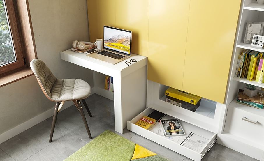
The Role of Furniture and Decor: Living Room Paint Colors That Make A Space Feel Bigger
The right furniture and decor choices can significantly enhance the illusion of spaciousness in a living room, complementing the effects of paint color and creating a harmonious, open feel. Careful consideration of furniture placement, the strategic use of mirrors, and mindful selection of pieces are key to achieving this.Furniture Placement Influences Perceived SizeThe arrangement of furniture directly impacts how large a room feels.
Overcrowding a space with large, bulky furniture instantly makes it seem smaller. Conversely, strategically placing furniture can create the illusion of more space. For instance, pushing furniture away from walls can create a sense of openness, while using lighter-colored, less visually imposing furniture will prevent the room from feeling cluttered. Leaving ample walking space between furniture pieces also contributes to a feeling of airiness.
Consider using multi-functional furniture, such as ottomans that double as storage or sofa beds, to maximize space efficiency without sacrificing style. A well-placed area rug can also define a seating area without visually shrinking the room, provided it’s appropriately sized for the space.
Choosing the right living room paint color can dramatically impact how spacious it feels. Lighter shades like soft blues or creamy whites are generally recommended, as they reflect light and create an illusion of more space. But did you know that the depth of field, something photographers often manipulate, plays a similar role? Learning about this effect, by checking out this article on Apa itu Bokeh?
, can help you visualize how light and shadow influence perception of size, much like how paint color affects your living room. Ultimately, the right paint choice can make even a small living room feel open and airy.
Mirror Placement Strategies
Mirrors are powerful tools for visually expanding a living room. They reflect light and create a sense of depth, making a room appear larger than it actually is. Placing a large mirror opposite a window is particularly effective; it reflects the natural light, doubling its impact and brightening the room considerably. Imagine a large, ornate mirror reflecting a vibrant garden view; the effect is stunning.
However, avoid placing mirrors directly opposite each other, as this can create an unsettling, repetitive effect. Instead, consider placing mirrors strategically on side walls or even above a fireplace mantel to add depth without overwhelming the space. The size and style of the mirror should also complement the overall aesthetic of the room. A simple, modern mirror might suit a minimalist space, while an antique mirror with an ornate frame could add a touch of elegance to a more traditional setting.
The key is to choose a mirror that enhances the room’s design without becoming a focal point that detracts from the overall spaciousness.
Furniture and Decor Selection
Choosing furniture and decor that complements the paint colors and overall design scheme is crucial for maintaining a sense of spaciousness. Opt for furniture with clean lines and light-colored upholstery. Dark colors tend to absorb light, making a room feel smaller. Lighter shades, such as creams, beiges, and pastels, reflect light and create a more open, airy atmosphere. Similarly, avoid overly ornate or fussy furniture; simpler designs allow the eye to travel freely through the space, enhancing the perception of size.
Keep the number of decorative items to a minimum, focusing on a few carefully chosen pieces that add personality without cluttering the room. Think about using open shelving instead of bulky cabinets to avoid visually weighing down the space. Instead of many small items, group similar decorative pieces together to create visual unity and avoid a cluttered look.
Remember, less is often more when it comes to creating a spacious and inviting living room.
Visual Examples
Let’s bring these color concepts to life with some detailed examples of how different paint choices can dramatically impact the perceived size and feel of a living room. These descriptions aim to illustrate the principles discussed earlier, showing how color, light, and furniture work together to create the illusion of space.
Light Blue Living Room
Imagine a living room bathed in the soft glow of a light, airy blue. The walls, painted in a shade reminiscent of a clear summer sky, immediately expand the space. The light reflects beautifully off the walls, creating a bright and open atmosphere. Furnishings are kept relatively light and simple: a cream-colored sofa with light wood legs, a glass-topped coffee table, and two armchairs upholstered in a pale linen fabric.
A large, sheer window curtain in a soft white allows ample natural light to flood the room, enhancing the blue’s luminosity. Decorative elements are minimal – a few strategically placed plants in white ceramic pots and a simple abstract painting in muted blues and greens complete the serene, spacious feel. A statement pendant light, sleek and modern in design, hangs centrally, providing focused illumination without cluttering the space.
The overall effect is one of calm spaciousness, where the light blue acts as a backdrop that enhances the room’s natural dimensions.
Living Room with a Feature Wall
This living room utilizes a bold, deep teal as a feature wall, anchoring one end of the room. The teal, a rich and saturated color, is balanced by the use of lighter, neutral tones on the remaining walls – a warm, off-white, for example. This creates a visual anchor without feeling overwhelming. The furniture is a mix of textures and tones.
A light grey sofa sits opposite the feature wall, and a natural wood media console complements the warmth of the off-white walls. Throws and cushions in shades of cream, beige, and muted greens introduce additional texture and visual interest without detracting from the feature wall’s impact. Lighting is key; floor lamps with warm-toned bulbs flank the sofa, providing ambient lighting, while recessed lighting highlights the feature wall, showcasing its depth and richness.
The overall effect is one of sophisticated elegance and surprising spaciousness, the deep color actually enhancing the sense of depth and creating a focal point that prevents the room from feeling bland.
Monochromatic Living Room
A living room painted in varying shades of grey creates a sophisticated and spacious environment. The walls are painted in a light, cool grey, while the trim and baseboards are in a slightly darker shade, adding subtle definition without breaking up the flow of the space. Furniture is chosen in shades of grey, ranging from a charcoal grey sofa to a light grey rug, creating a cohesive and calming effect.
A few pops of color are introduced through carefully selected accessories: a throw pillow in a muted teal, a vase with a single stem of white flowers, and a piece of artwork with subtle grey tones. Lighting is soft and diffused, using a combination of floor lamps, table lamps, and recessed lighting to avoid harsh shadows. The monochromatic scheme, with its subtle variations in tone and texture, creates a sense of calm and spaciousness, making the room feel larger and more serene than its actual size.
Outcome Summary
Ultimately, choosing the right paint colors for your living room is a journey of visual exploration and creative problem-solving. By understanding the interplay of light, color, and spatial perception, you can transform a seemingly small space into a haven of comfort and style. Remember, it’s not just about the paint; it’s about creating a cohesive design that maximizes your living room’s potential.
Experiment with different palettes, textures, and furniture arrangements to find the perfect balance that reflects your personal style and enhances your living experience.
Questions Often Asked
What are some common mistakes to avoid when choosing living room paint colors?
Common mistakes include choosing colors that are too dark or saturated for a small room, neglecting natural light sources, and ignoring the impact of furniture and decor on the overall feel of the space.
How can I make a north-facing living room feel brighter?
North-facing rooms often lack direct sunlight, so opt for warm, light-reflecting colors like creamy whites, warm beiges, or soft yellows to compensate. Adding mirrors to reflect existing light can also help.
Can I use dark colors in a small living room?
Yes, but strategically. Use darker colors on a single accent wall or in smaller, defined areas. Balance them with plenty of light and lighter colors on the other walls to prevent the room from feeling claustrophobic.
How important is sheen when choosing paint?
Sheen impacts light reflection. Higher sheens (like semi-gloss or gloss) reflect more light, making a room feel larger, but they also highlight imperfections. Lower sheens (like matte or eggshell) hide imperfections better but absorb more light.

- Transform Your Front Porch with These Top 15 Decoration Ideas - July 8, 2026
- Floom App Twitter Wrapped 2022, Begini Cara Menggunakannya - July 7, 2026
- Download QuickShortcutMaker APK v2.5.0 dan Versi Lama - July 6, 2026